

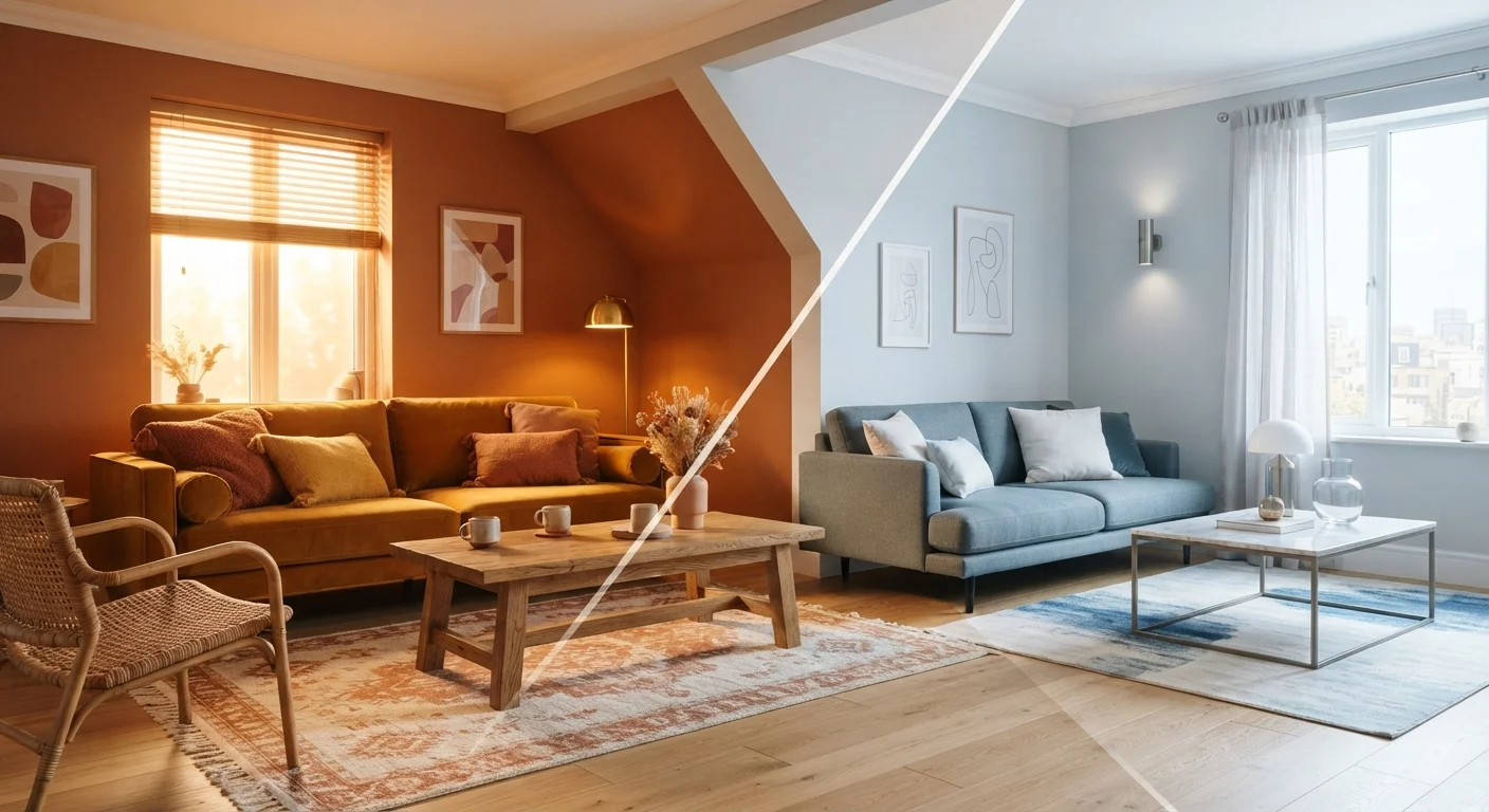
Key Takeaways
- Warm colours (reds, oranges, yellows) make spaces feel cosy and intimate.
- Cool colours (blues, greens, greys) create a calm, airy, or energising atmosphere.
- Both paint colour and light bulb temperature interact — mismatching them can make a room feel 'off'.
- North-facing rooms benefit from warm tones to counter naturally cool, blue-tinted light.
- You don't need to redecorate to shift colour temperature — changing bulbs or adding textiles can have a meaningful impact.
Colour Temperature
Colour temperature describes the warmth or coolness of a colour — whether it reads as amber and yellow-toned, or blue and grey-toned. In home décor, it applies to both paint shades and light sources. It's one of the most powerful tools for shaping how a room feels emotionally, not just visually.
In lighting, colour temperature is measured in Kelvins (K): bulbs below 3000K are considered warm, 3000–4000K neutral, and above 5000K cool or daylight-balanced.
Warm vs. Cool: The Core Distinction
Every colour sits somewhere on a spectrum from warm to cool. Warm colours — reds, oranges, yellows, and creamy whites — are associated with fire and sunlight. Cool colours — blues, greens, blue-greys, and crisp whites — evoke sky, water, and shade. Neutral tones like beige, taupe, and greige can lean either direction depending on their undertones.
This distinction matters in décor because our brains respond emotionally to these cues before we consciously analyse them. A room painted terracotta feels enveloping; the same room in slate blue feels more expansive. Neither is better — they simply serve different purposes and suit different people.
Understanding where your colours sit on this spectrum is foundational. See the principles behind every well-decorated room for how colour temperature fits into broader styling decisions.
Test Paint in Real Conditions
Always sample paint colours on the actual wall, not just on a chip or in a store. Live with the sample through a full day so you can see how it shifts from morning light to artificial evening lighting. What looks like a perfect warm beige under midday sun may turn distinctly orange under incandescent bulbs.
How Light Interacts With Paint Colour
Paint colour and light source colour temperature work together — sometimes harmoniously, sometimes against each other. A warm-toned paint applied in a room lit by cool, blue-white bulbs may look muddier than expected. Conversely, a bright white painted in warm candlelight can turn distinctly yellow.
This is one of the most common reasons rooms feel unexpectedly 'off' even after a fresh coat of paint. Rooms can feel wrong even when everything matches because a cool-toned wall colour is fighting against warm-toned bulbs, creating visual tension that's hard to name but easy to feel.
Before committing to a paint shade, test it under the actual lighting conditions your room uses — both natural daylight at different times of day and your artificial light at night. A small painted test card held against the wall is more revealing than any paint chip.
2700K
Ideal bulb warmth for relaxing home spaces
Lighting designers commonly recommend 2700–3000K bulbs for living areas and bedrooms to create a warm, comfortable ambience.
~60%
Homeowners who misjudge paint colour under store lighting
Interior design professionals frequently note that paint colours chosen under retail fluorescent lighting can look markedly different once installed at home under different light sources.
Choosing Colour Temperature by Room Function
A useful framework is to match colour temperature to how you want to feel in a given space:
- Bedrooms: Warm tones promote relaxation. Soft whites, warm greys, blush, and terracotta are common choices. Bulbs in the 2700K range support winding down.
- Kitchens: Neutral-to-cool tones work well for clarity and hygiene perception. Cooler lighting (3000–4000K) helps when prepping food.
- Home offices: Cooler, more energising tones can support focus. Daylight-balanced bulbs reduce eye strain during long work sessions.
- Living rooms: Flexible, layered approaches work best here — warm ambient lighting with the option of cooler task lighting for reading.
For a full breakdown of how to layer light in each room, the complete guide to lighting your home covers ambient, task, and accent strategies in depth.
Adjusting Colour Temperature Without Repainting
You don't need to commit to a renovation to shift a room's colour temperature. Several accessible changes can meaningfully alter the feel of a space:
- Swap bulbs: Replacing cool-white bulbs with warm-white equivalents is among the fastest, most affordable changes you can make.
- Add textiles: Warm-toned throws, cushions, and rugs pull a room toward a cosier register, even against a cool-coloured wall.
- Introduce plants: Green sits in the middle of the warm-cool spectrum and acts as a natural harmoniser. Indoor plants change how a room feels in ways that go beyond aesthetics.
- Use mirrors and metals: Warm-toned metals (brass, bronze) reinforce warmth; chrome and silver amplify cooler palettes.
One common misconception is that all-white rooms read as neutral. In practice, white has strong undertones — some pull pink and warm, others blue and cool — and the wrong choice for your lighting can make a room feel stark rather than serene. Popular décor myths can quietly cost you style, and the idea that white is always a safe default is one of them.