

Key Takeaways
- Mixing metals, patterns, and wood tones is a legitimate design technique, not a mistake.
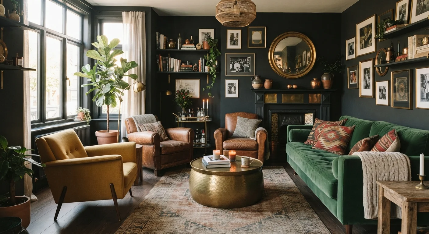
- Dark paint colours can make small rooms feel intimate and sophisticated rather than cramped.
- Matching furniture sets often produce rooms that look staged rather than lived-in.
- Proportion and intention matter more than strict rules about what goes with what.
- Understanding why a guideline exists lets you break it intelligently.
Why Decorating 'Rules' Stick Around
Interior design advice travels fast — from home improvement TV shows to social media feeds — and certain guidelines get repeated so often they calcify into absolute truth. The problem is that most of these rules were originally shorthand for a nuanced principle, not a law. When the shorthand outlives the explanation, it becomes a trap.
Understanding which rules deserve flexibility — and why — is one of the most effective styling upgrades you can make. It costs nothing, and it opens up a much wider palette of choices. See also the core principles behind well-decorated rooms for the foundational ideas that actually do hold up.
Myth
You should never mix metals in a room — it looks chaotic and unfinished.
Fact
Mixing metals is a standard technique in professional interior design, as long as one finish is dominant and the others act as accents.
The fear of mixing metals — combining brass, chrome, matte black, or nickel in the same space — comes from a reasonable instinct about visual consistency. But professional designers regularly layer two or three metal finishes to add depth and prevent a room from feeling flat or overly coordinated. The key is proportion: choose one primary finish that appears most frequently (say, 60–70% of hardware and fixtures), and let secondary finishes appear in smaller doses. A brushed gold pendant light pairs naturally with chrome cabinet pulls when the contrast is intentional rather than accidental.
Myth
Light colours always make a small room look bigger.
Fact
Colour alone doesn't determine perceived size — light, contrast, proportion, and the placement of furniture all play equally important roles.
Light paint is often recommended for small rooms because it reflects more natural light, which can help a space feel airy. However, a poorly lit room painted pale grey will still feel dim and cramped. Conversely, a small room painted in a deep, saturated colour — navy, forest green, or charcoal — can feel intimate and expansive in a different way, because the eye is less aware of the walls as boundaries. Colour temperature also matters: a warm-toned dark paint can feel enveloping rather than oppressive. Scale of furniture and the amount of natural light are at least as influential as wall colour.
Myth
A matching furniture suite makes a room look polished and put-together.
Fact
Matching sets often produce rooms that look staged or showroom-like, lacking the layered character that makes spaces feel lived-in and personal.
Furniture suites — where every piece in a bedroom or living room comes from the same collection — were heavily marketed throughout the mid-twentieth century as a convenience shortcut. The result is a room where every element has the same age, finish, and visual weight, which paradoxically makes the space feel less interesting. Interior stylists typically mix pieces from different eras and sources, using shape, scale, and colour to create cohesion instead. A vintage side table next to a contemporary sofa creates a conversation that a perfectly matched set cannot. The decorating philosophy you adopt will shape how much mixing feels right for your space.
Myth
You should always hang artwork at eye level.
Fact
"Eye level" is a useful starting point, but the correct height depends on ceiling height, furniture below the piece, and how the artwork relates to the rest of the wall.
The eye-level guideline — often cited as 57–60 inches from the floor to the centre of the artwork — originates from museum hanging standards, where pieces are displayed without surrounding furniture context. In a home, artwork above a sofa should sit 6–10 inches above the top of the cushions to read as part of a visual grouping, which often places the centre of the piece higher or lower than the standard formula suggests. In rooms with high ceilings, hanging artwork at standard eye level can leave a disconnected gap of empty wall above it. Let the furniture arrangement and wall proportions guide placement rather than a universal rule.
Myth
Rugs should match or directly coordinate with your sofa colour.
Fact
A rug's primary job is to anchor a seating arrangement and define a zone — its colour relationship to the sofa is a secondary consideration.
Matching the rug directly to the sofa often results in a monotone zone that lacks visual interest. A more effective approach is to draw a rug colour from a secondary or accent element in the room — a throw pillow, a piece of artwork, or a plant pot — which creates a thread of repetition without an obvious match. The rug's pattern, texture, and scale relative to the furniture footprint matter more than its hue. A general guideline: in a seating arrangement, the front legs of sofas and chairs should sit on the rug to tie the grouping together, regardless of colour.
How to Apply the Facts in Your Own Home
Knowing a myth is false is only half the work. Putting that knowledge into practice requires a slightly different lens: instead of asking "does this follow the rule?", ask "does this serve the room?"
57%
Homeowners who feel their décor doesn't reflect their personality
According to a Houzz survey on home décor satisfaction, more than half of respondents felt their space didn't truly represent their personal style, often citing uncertainty about breaking conventions.
3x
More visual interest from mixed versus matched furniture
Interior design educators widely observe that rooms combining pieces from different eras and sources read as more layered and intentional than uniformly matched suites.
Start by identifying one guideline you've been following by default. If you've avoided a bold wall colour because you heard dark rooms feel small, try a deep tone on a single accent wall and observe how the room changes. If you've been matching all your metals because mixing seemed risky, introduce one contrasting finish — brushed brass against matte black, for instance — and see whether the tension actually reads as intentional.
Rooms that feel cohesive typically share a sense of proportion and a deliberate point of view, not identical finishes. That's the real principle behind advice like "keep it consistent." For a deeper look at what actually causes rooms to feel unsettled, explore what makes rooms feel 'off' even when everything matches.
Don't Confuse Breaking Rules with Ignoring Proportion
Decorating myths are worth challenging, but a few underlying principles — particularly scale, proportion, and adequate lighting — remain genuinely important. A bold colour choice in a windowless room may still read as oppressive regardless of intent. Test bigger decisions incrementally where possible, and give changes time to settle before committing fully.
Renters navigating these ideas within lease constraints have more options than they might expect, too. Decorating a rental without losing your deposit covers reversible approaches that let you test bolder ideas without permanent commitment.